Monday, September 30, 2013

Elements of Art and Principles of Design for Photography

Elements of Art: 
Line - marks made by a pointed tool which can vary in width, length, direction, curvature and color.
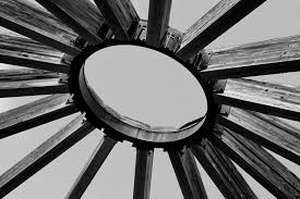
I picked the picture above for its many lines, and one complete line forming an angle in the center.
I picked this photo for all of its seemingly continuous and geometrically perfect lines.

Shape - are formed whenever the ends of a continuous line meet, and can form a geometric (uniform) or organic (natural) shapes.
I picked this photo for its distinctly organic shape. 
I chose this picture for its varying geometric and organic shapes.

Color - Color wheels show the primary colors, secondary colors, and the tertiary (intermediate) colors. They also show the relationships between complementary colors across from each other, such as blue and orange; and analogous (similar or related) colors next to each other such as yellow, green, and blue. Black and white may be thought of as colors but, in fact, they are not. White light is the presence of all color; black is the absence of reflected light and therefore the absence of color.
If it wasn't already obvious enough, I picked this photo for its wide spectrum of colors.
I chose this painting for its wide variety of colors.

Value (Tone) - Value, or tone, refers to dark and light; the value scale refers to black and white with all gradations of gray in between. Value contrasts help us to see and understand a two-dimensional work of art.
I chose this photo for its very distinct white, gray, and black pieces.
I chose this painting for its varying elements of white, black and gray in the clouds.

Form Form describes objects that are three-dimensional, having length, width, and height.
I picked this photo because of its obvious cubes created from the varying angles of the cubes.
I chose this painting because it shows many shadows across the subject defining his features.

Texture - Texture can be rough, bumpy, slick, scratchy, smooth, silky, soft, prickly--the list is endless.  Texture refers to the surface quality, both simulated and actual, of artwork.
I chose this photo for the texture the snow seems to create upon the boulder.
I chose this painting for texture, as the tree appears very detailed making it very life like. 

Space - Space refers to distances or areas around, between, or within components of a piece. Space can be positive (white or light) or negative (black or dark), open or closed,shallow or deep, and two-dimensional or three-dimensional.
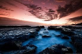
I chose this photo for the space between each individual rock.
I picked this photo because of the empty white space around the subject.

Principles of Design: 
Balance - Balance is the comfortable or pleasing arrangement of things in art. There are three different types of balance: symmetrical, asymmetrical, and radial. The human figure is symmetrically balanced; the same on the left and right side. The tree is asymmetrically balanced; its branches are not distributed equally on each side, but their total weight is balanced left and right. The sun is an example of radial balance; all its rays are equal in length from the center.
I picked this painting for it's seemingly perfect balance.
I chose this photo for its radial balance.

Contrast - Contrast is created by using elements that conflict with one another. Often, contrast is created using complementary colors or extremely light and dark values. Contrast creates interest in a piece and often draws the eye to certain areas. It is used to make a painting look interesting.
I chose this painting for its contrast from bland white to colorful clothing and items drawing attention to the subjects rather than the diner itself.
I picked this photo for contrast as there is a distinct difference between the lighter colored sunset, and the dark clouds and other darker pieces on the ground.

Emphasis - Emphasis in the focal area of an artwork gives it importance. An artist may stress some elements of the design over others. The eye of the viewer will focus on the area of emphasis or center of interest first, then take in the rest of the composition.
I chose this painting for emphasis as the painter uses contrast to emphasize his subject.
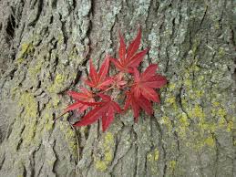
I chose this photo for emphasis as the differing colors draw the eyes to the leaves rather than the bark of the tree.

Movement - Movement in an artwork means the artist is taking viewers on a trip through the work by means of lines, edges, shapes, and colors often leading to the focal area. Movement is a visual flow through the composition. It can be the suggestion of motion in a design as you move from object to object by way of placement and position. Directional movement can be created with a value pattern. It is with the placement of dark and light areas that you can move your attention through the format.
I chose this painting for movement as it looks to be like the waves are actually moving as your eye follows the waves.
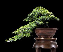
I chose this photo for movement, because when I looked at it my eyes followed the direction of the branches and leaves leading all the way to the end.

Pattern - Patterns are made in art when the same shapes or elements are repeated again and again. Pattern uses the elements of art in planned or random repetitions to enhance surfaces of paintings or sculptures.
I chose this painting for pattern as the element of each person is repeated over and over to make what appears to be a crowd.
In this photo there is two different patterns, one for the leaves, and one for the brown plants in the center.

Rhythm - Rhythm is the repetition of shapes, lines, and forms. Rhythm is a movement in which some elements recurs regularly. Like a dance, it will have a flow of objects that will seem to be like the beat of music.
I chose this painting for rhythm as the pattern seems simple enough as the gossip travels from person to person.
This photo gave me a sense of rhythm as there seems to be a flow as the spiral wraps itself around the center pole.

Unity - Unity means that all elements in an artwork are in harmony. Unity brings together a composition with similar units. For example, if your composition was using wavy lines and organic shapes you would stay with those types of lines and not put in even one geometric shape
I chose this painting for unity as there are no geometric shapes - only organic ones.
I chose this photo for unity as almost the entire photo is the entire photo is the same color.

Thursday, September 26, 2013

Avoiding Mergers

Interestingly enough, I picked this photo because the man on the right seems to blend right into the building, making it look as if the rest of the building is his head, this combined with the multiple shots of only half of most of the people made me pick this photo for Avoiding Mergers.

Framing

I picked this photo for Framing because it shows depth, from the man in the blue hat, to the people in-between, and finally to the massive column of smoke pouring from the building.

Balance

For this photo I looked at the people spread out everywhere, the position of the cars, and the trees in the background all forming triangles and other shapes in their own right.

Lines

I picked this photo for Lines because the building tops and windows form lines into the smoke in the distance, creating an interesting angle, and distinct lines for the eyes to follow into the distance.

Rule of Thirds

This photo shows the Rule of Thirds clearly as the building is in one intersection of these lines, the destroyed smoking part of the building is in another, and the smoke drifting off into the distance is in another intersection.

Simplicity

I picked this photo to show simplicity because it shows only two subjects - the twin towers and the smoke - drawing the attention directly to these objects.

Friday, September 20, 2013

Photo Manipulation and Ethics

1A. This story focuses on how unethical and inappropriate editing photos has become for the media. It gives many examples such as a missile launch in the Middle East, and a portrait of the cabinet of Israel. Both examples have been edited to show something dramatically different changing the viewers outlook on the photo.

1B. I believe that this editing is unacceptable and is very unethical because it not only changes the photo, it also changes the viewers outlook on the photo affecting how the viewer feels about the photo. This can lead to false information and degradation the trust between the photographer and the viewer.
2A.

I believe that this photo is the most unethical because it appears to be that the soldier is trying to stop the man, as if the man is opposing him in some way, or he is threatening the soldier. This ends up leading the viewer to believe different things about this photo than was originally photographed which implies the editor wants the viewer to believe in their "lie", leading them on with false information.
2B.
I believe that this photo is the least unethical because the photographer wanted to capture the full view of the pyramids in a small space, deciding rather to edit it to make them seem closer together. This is not as bad as others because it probably could have been done with a different angle and more time.

40 Greatest Photos Ever

Rich Lam / Getty Images
1. I picked this photo because the subject of the photo almost seems hidden behind the riot officer.
2. The composition of this photo is distinct in that it focuses between the people behind the subject and the officer in the foreground.
3. I believe this photo was picked for the top 40 because it inspires emotion for the viewer.
"Aid from a Padre" - Hector Rondon Lovera
1. I picked this photo because it caught my eye with its simplicity, yet complex idea presented in this photo.  
2. The composition was very interesting in fact, the black and white added a certain effect that could not have been done if it was taken with color, there also seems to be a glow around the priest and soldier, adding to the dramatic effect.
3. I believe that this photo made it into the top 40 for its sad outlook and visually striking power. 
Asianewsphoto / Reuters
1. This photo caught my eye with it's predominant yellow color with and all of the people surrounding the subject.
2. The composition of this photo is very focused, being centered around the man and the monk, drawing the viewers eyes to the subject.
3. I believe this photo made the top 40 because of its blatantly sad view, yet peaceful outlook.

Wednesday, September 18, 2013

Post Shoot Reflection

http://chris19963.blogspot.com/

- Taken from a variety of angles, making each picture diverse and intriguing.
- Each picture is taken with a person, making the photos more alive in a way.

- Try using a half-press to focus the lens so you can get the subject of the photo more in focus, so the photo does not appear blurry.

National Geographic Warm-up

This is my favorite photo because of the way it catches your eye - using a distinct source of light as the subject of the photo. This creates a mysterious and interesting effect upon the sand and other particles in the air. The way the light reflects off of the walls of the wind weathered walls catches the eye with their parallel lines.
To illustrate the world around me I could take a photo of the trail leading into the forest near my house, because it is a very relaxing and calm place. A photo that I would take would be one of the trail leading off into the distance with the sunset overhead, which I have already taken.

Monday, September 16, 2013

Great black and white photographers Part 2

Edward Weston
- Born on March 24th, 1886 in Highland Park, Illinois.
- Died on January 1st 1958 at the age of 71.
- Dropped out of school in 1897, but went on to almost graduate from the Illinois School of Photography if not for his reluctancy to pay for the full course, even though he had already completed the course on his own, would have graduated.
- Photographer for 40 years, his main career.
- Two of his most famous (and most expensive) pictures taken are Nude, taken in 1925, and Nautilus, taken in 1927, selling for $1,609,000 and $1,082,500 respectively.
- My two favorite pictures by this photographer:
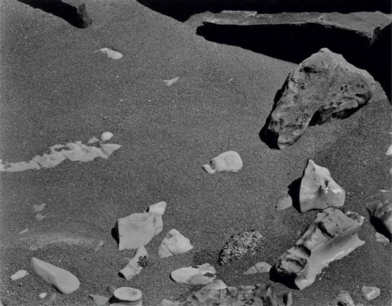
"Rocks and Pebbles" taken in 1948
"Point Lobos" taken in 1946

Red, Metal, and Happy pictures

Red

 
Metal

Happy

Thursday, September 12, 2013

Camera Parts

Aperture - refers to the diameter of the aperture stop rather than the physical stop or the opening itself.

Shutter - is a device that allows light to pass for a determined period of time on to film.

Exposure - the measurement of light and dark in a given subject.

Depth of Field - the distance between the nearest and farthest objects in a scene that is acceptably sharp.

F-Stop - the number of stops that can adjust the lens aperture.

Focal length - the distance in millimeters from the optical center of a lens to the to the imaging sensor when the lens is focused at infinity.

1. Lens release button - releases the lens for maintenance or to switch it out
2. Menu button - takes the user to a menu with different options for use
3. Settings button - takes the user to a menu that allows the user to change settings to their liking
4. Erase button - erases the given file/picture when selected
5. Magnify button - can be used to give magnification when needed

Tuesday, September 10, 2013

Camera History

1. In ancient times Greek and Chinese philosophers discovered an odd optical effect they dubbed the "camera obscura" which is Latin for "dark room", this is considered the first camera; the small hole in the wall acted like a lens focusing and projecting light onto the wall of the dark chamber.
2. In the 17th century Isaac Newton and Christian Huygens perfected the understanding of optics and the process of making high quality glass lenses which we now use for lenses in our cameras.
3. In 1827 Joseph Nicéphore Niépce nearly completed the camera's design by adding film, making the camera a glass lens, a dark box, and film to effectively take a picture, develop it, and keep the photo.
4. This design is very similar to a modern camera's in that it has all of the components other than the computer.
5. Digital cameras go through a process with a computer to capture images with an electronic sensor called a "CCD" on a reusable data storage device.

6. The difference between the "Auto" and "Program" modes is that "auto" controls the flash and the exposure, while in program the photographer can usually control these factors.
7. The "Portrait" mode is a mode that attempts to blur out the background while capturing the foreground or something in the foreground. This is done by using the fastest available lens setting.
8. The "Sports" mode is used not only for sports, but also for capturing images with a lot of motion, hopefully getting rid of the blur. This works by using the highest shutter speed available.

9. A photographer should use the half-press to focus on the subject, in doing so the half-press will give the camera a faster response time, gives the photographer more control over the focus, and encourages better composition.

10.
 This icon on the camera indicates that the flash is disabled, so there will be no flash. This flash mode is usually used if the photographer wants a moodier feel, or wants the natural light.
11.
 This icon on the camera indicates that the "auto flash" is enabled, which means that if the computer in the camera decides it is too dark, it will flash giving the picture more light. This flash mode is used by default.

12. If there is too much light in the photo, the exposure will be off balance, and the photo will be washed out.
13. If there is not enough light in the photo, the exposure will be off balance as well, and the photo will be too dark.

14. A "stop" is a term used in photography to represent a relative change in the brightness of light in a photo.
15. On a planet with two suns, the brightness level would be 1 stop compared to our planet.
16. On a planet with four suns, the brightness level would be 2 stops compared to our planet.

17. A longer shutter speed will open the shutter for longer, letting in more light.
18. A shorter shutter speed will open the shutter for less time, letting in less light.
19. The "aperture" controls the light before it hits the film, acting as a pupil.
20. When adjusting the aperture opening you can use the "f-stop" to adjust the openings.

Friday, September 6, 2013

Black and White Part 1

 William Eggleston - Morton, Mississippi - 1969/70
 Robert Adams - Untitled, Denver - 1970-1974
Edward Weston - Grass Against Sea - 1937