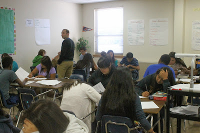
Avoiding Mergers
1. I think I did okay for this rule, as there are a few people being cut out of the photo.
2. The subject of this photo is Mr. Ashlock.
3. I think that at first glance the subject would not be very clear, but after looking at the photo again the subject would be clearer.
4. I believe if I had checked who was in the photo and who wasn't I could've made this a better photo.
Balance
1. I think I did okay for showing balance in this photo as I tried to get students on both sides of the photo.
2. The subject of this photo was Mr.Peters.
3. I feel that since the subject is so far away it is hard to recognize him at first, so the subject is not clear at first.
4. If I was closer to the subject, then I believe this could've been a better photo.
Framing
1. I think I caught some aspect of Framing as I used both the pillar on the right and the girl on the left to show depth.
2. The subject for this photo was the girl in the middle who is doing work.
3. I think the subject is rather obvious in this photo as there are only three people in the photo.
4. If I had checked the little things in this photo like the elbow and part of the student I could've taken a better picture.
Lines
1. I think I caught some good lines, but they do not really lead to anywhere.
2. The subject would have to be the people on the computer, but with the "line" it makes it seem as if the person on the very end is the subject.
3. I think the subject is not very clear in this photo because there are too many people and things distracting from the subject.
4. The subject is not very clear, and the rule is not as prevalent as I had hoped.
Rule of Thirds
1. I believe that if I was closer, then I could've caught a better example of the Rule of Thirds.
2. The subject is the person looking forward on the bottom left.
3. I feel that the subject of this photo is not very clear, and that it would be hard for someone to see the subject.
4. If I had moved then this photo would have been a better example of the Rule of Thirds.
Simplicity
1. I believe that if I changed to a little different angle I could have taken the separate table in the upper left out of the photo.
2. The subject is the student in the center that is working.
3. If someone were to look at this photo I think they would easily point out the subject.
4. For simplicity I think I did alright, but I do think I could have made the photo even simpler than it currently is.


No comments:
Post a Comment